

A dining experience rooted in Indian heritage, balance, and hospitality.
Saatvik began with a simple question: What would an upscale Indian restaurant look like if the entire experience reflected the same sense of intention as the food?
The concept is built around sattva, a philosophy associated with purity, balance, and harmony. The restaurant serves a completely saatvik menu, but I wanted the identity to communicate more than a dietary philosophy. It needed to feel elevated, immersive, and deeply rooted in the Indian tradition.
The result is Saatvik, a restaurant brand where food, architecture, and visual identity come together as one authentic experience.
The Inspiration:
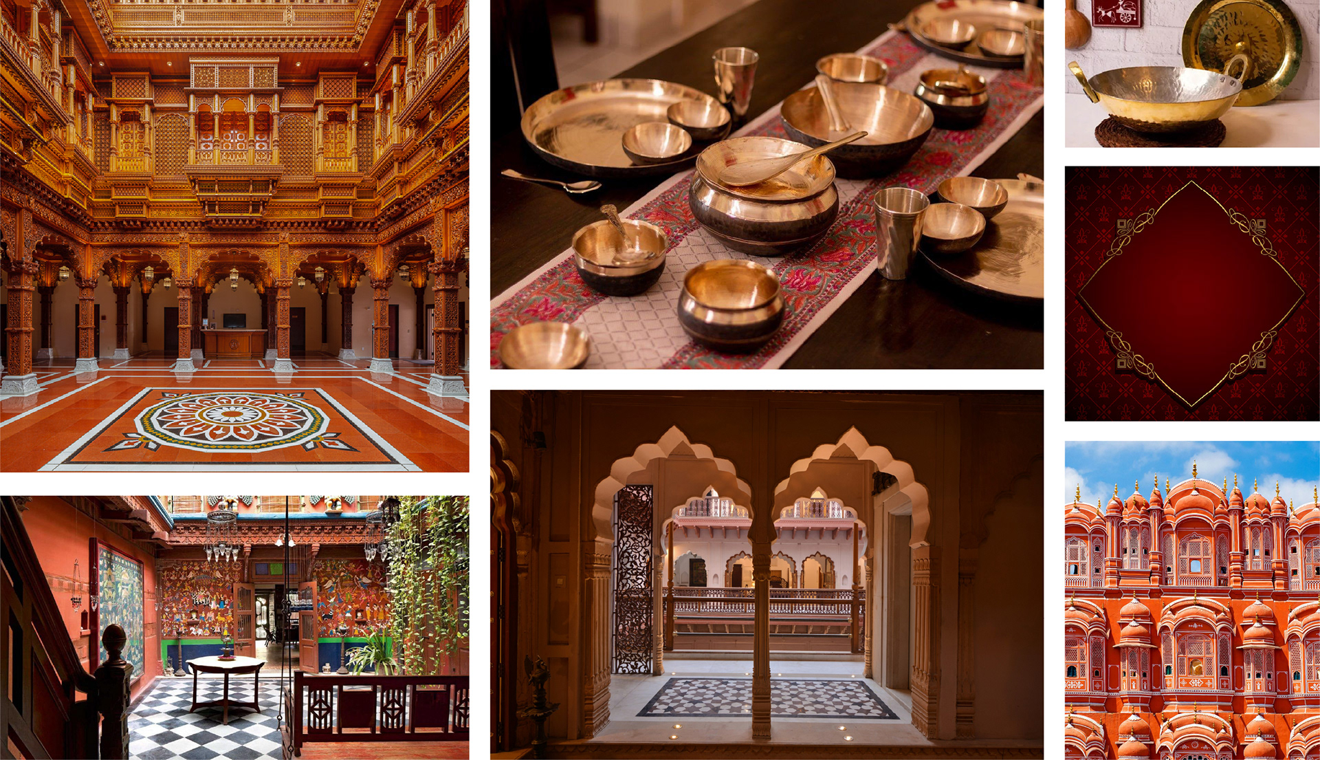
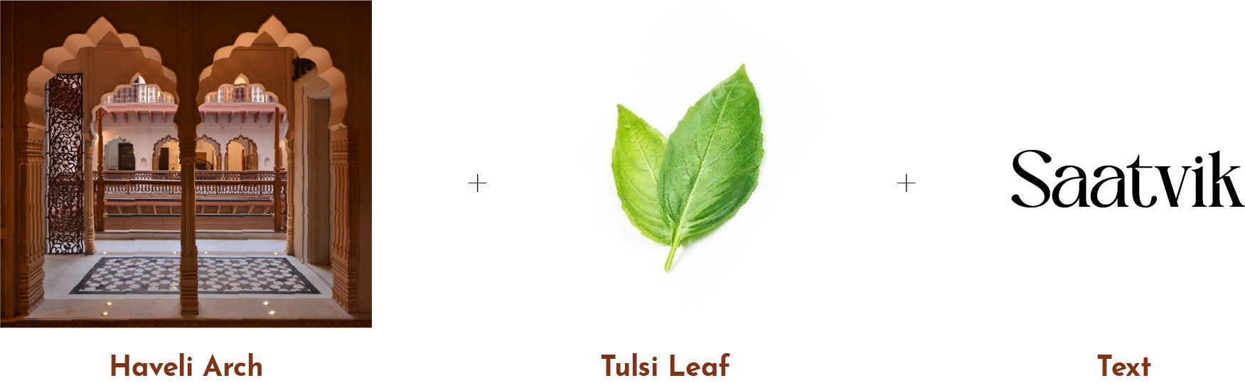
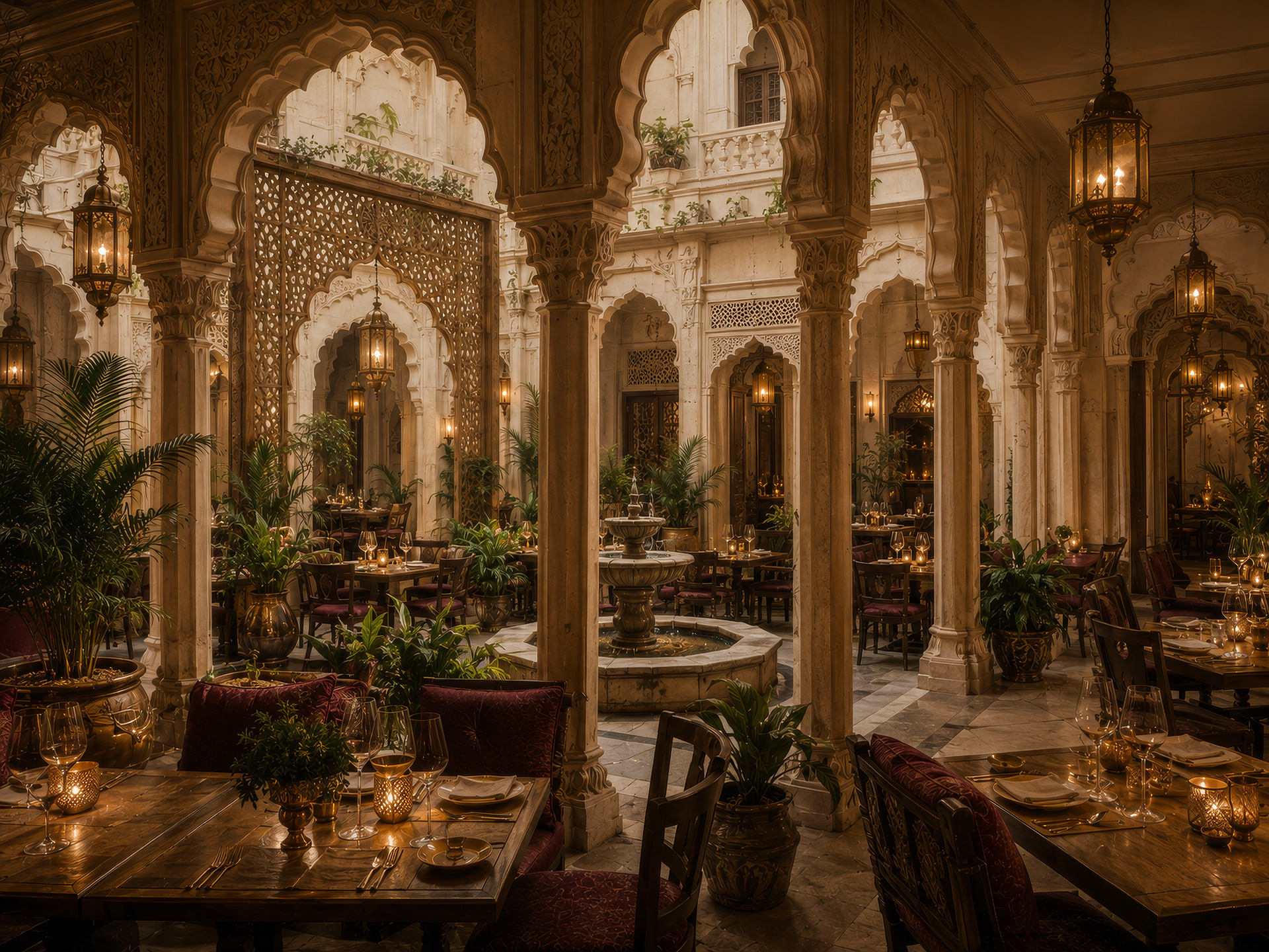
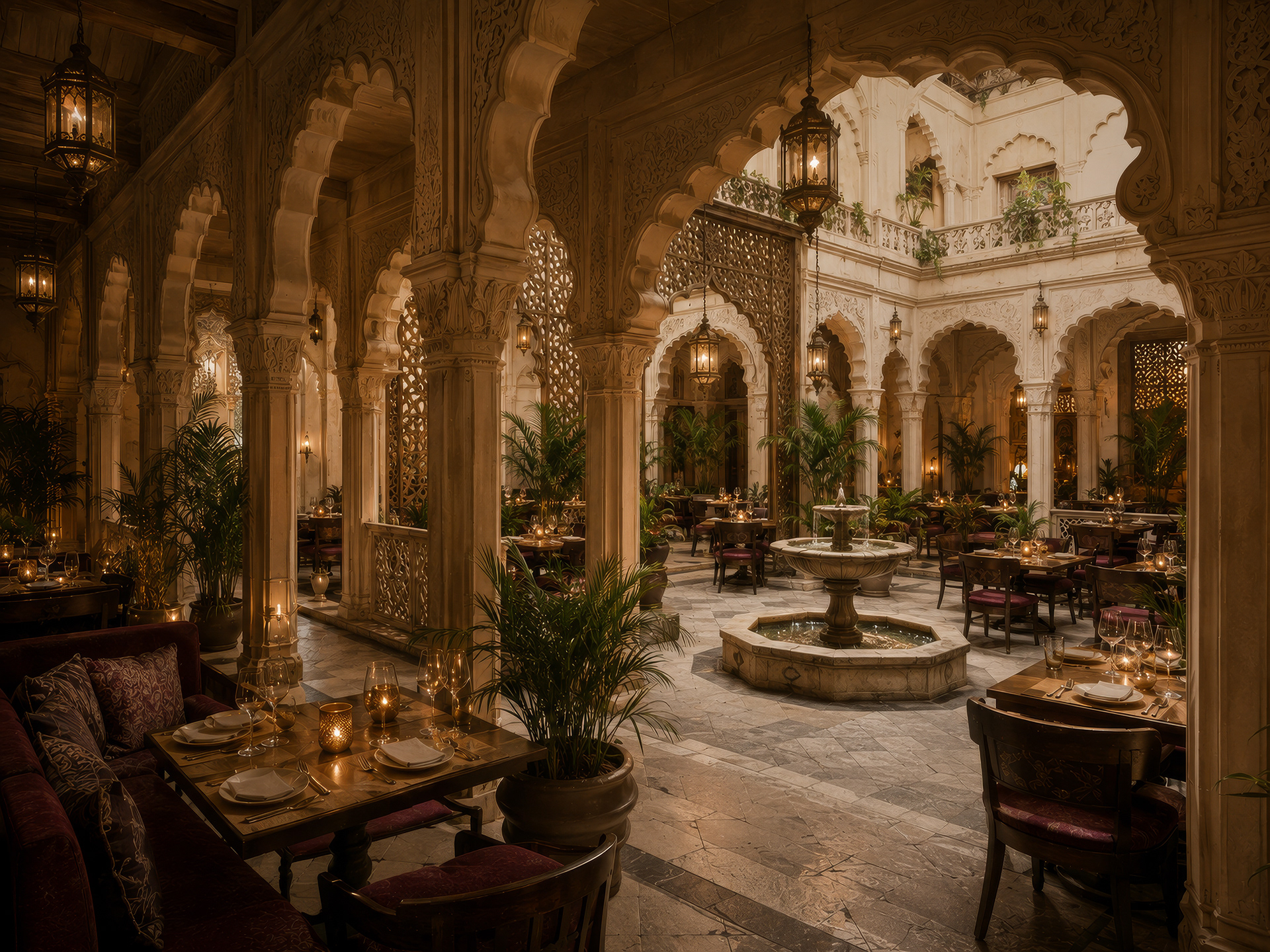
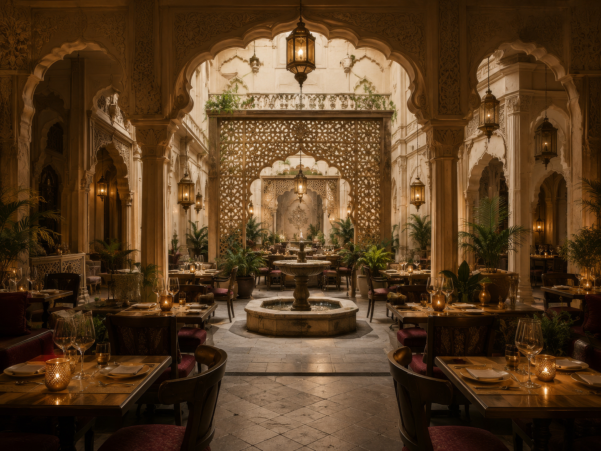
The visual language of Saatvik draws heavily from traditional Indian Haveli architecture. Havelis were designed around gathering, hospitality, craftsmanship, and a strong connection between interior and exterior spaces. Their carved archways, ornamental screens, courtyards, detailed borders, and warm natural materials became the foundation for the brand.
Branding:
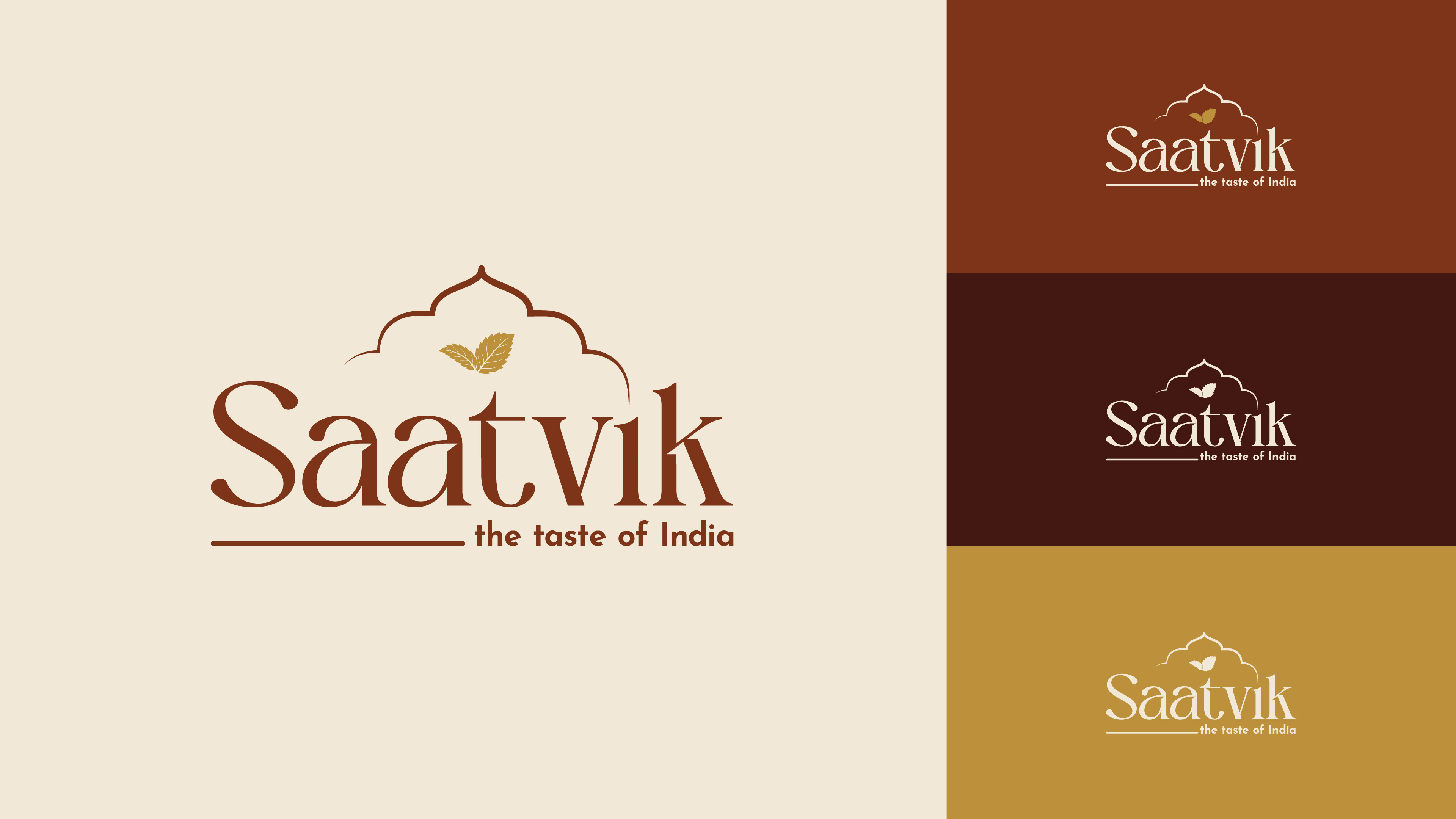
The logo uses an elegant typographic approach designed to feel sophisticated and established, while subtle ornamental details connect it back to the architectural inspiration behind the restaurant.
A Palette Inspired by the Haveli:
The color system takes inspiration from aged stone, warm plaster, natural pigments, antique metals, and the golden light found inside traditional Indian courtyards. Deep, grounded colors create contrast against softer neutrals, while antique gold introduces a sense of ceremony and refinement. The palette gives Saatvik a sense of warmth without losing the sophistication expected from an upscale restaurant.

Typography as Atmosphere:
Typography plays an important role in balancing heritage and modernity. The typeface brings elegance and personality to the brand, particularly across large titles and editorial moments.

Turning Architecture Into a Graphic Language:
One of the key elements of the identity is a decorative border system inspired by Haveli architecture. Instead of treating ornament as decoration alone, I developed it as a recurring piece of the visual language. The border can frame a menu, wrap around packaging, appear as a subtle pattern, or become an architectural detail within a layout. Its repetition creates consistency across the brand while reinforcing the relationship between the identity and the physical restaurant.

The Menu:
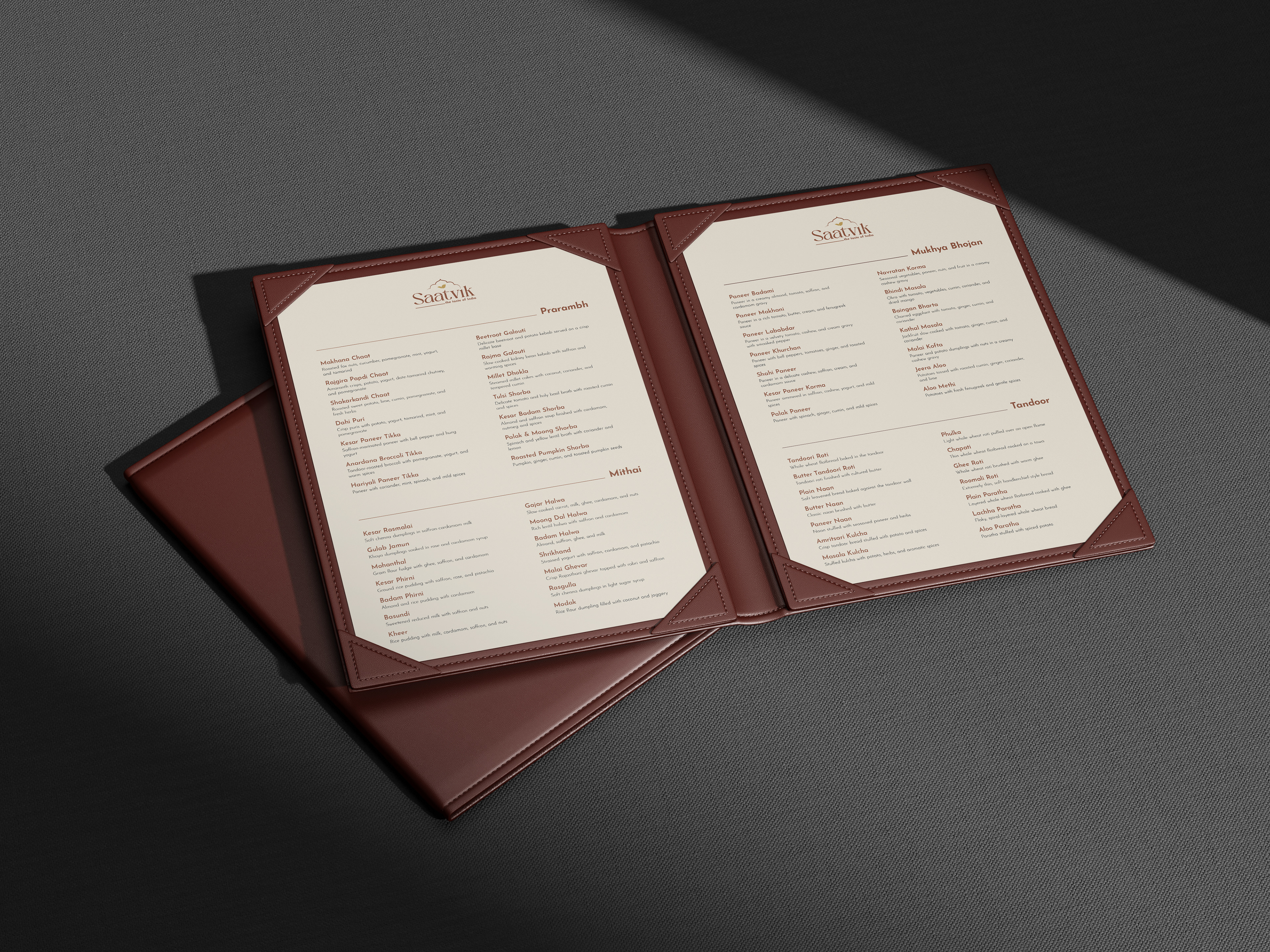
The menu brings the complete system together. Typography, spacing, color, and ornament are used with restraint so the food remains the focus. The layout takes inspiration from the quiet symmetry and structure found throughout Haveli interiors. The menu features Saatvik-friendly interpretations of Indian cuisine, from small plates and traditional Mukhya Bhojan to breads and mithai. Rather than making the menu feel overtly decorative, I wanted it to feel like an object belonging within the environment itself.
Beyond the Restaurant:
Saatvik needed to remain recognizable after the guest left the dining room. The take-out bag translates the visual identity into a simple, elevated piece of packaging. It relies on strong typography, the simplified mark, and the established architectural details rather than additional graphics.
The mithai box offers another expression of the brand. Indian mithai is closely tied to gifting, celebration, and hospitality, making the box an opportunity to create something that feels more ceremonial. The packaging uses the identity more richly, transforming a takeaway item into a keepsake and extending the restaurant's sense of occasion into the home.
Together, these applications demonstrate how Saatvik can exist at different levels of expression while maintaining the same underlying visual language.
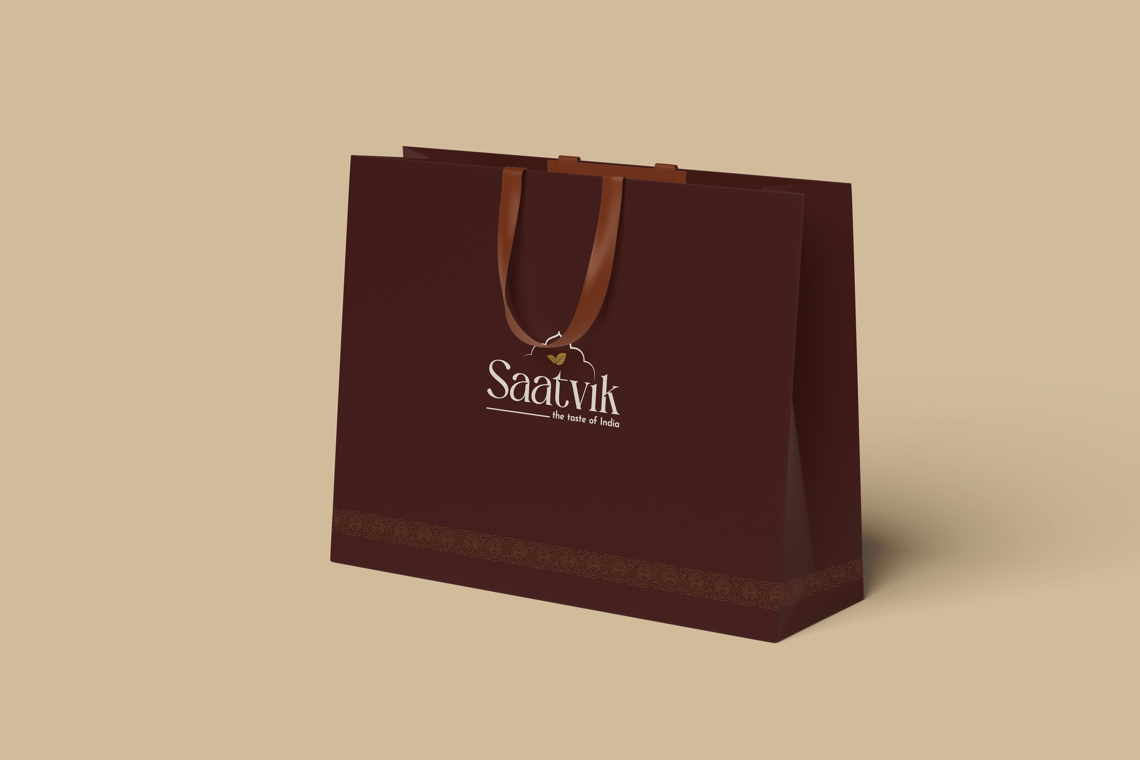
Take Out Bag
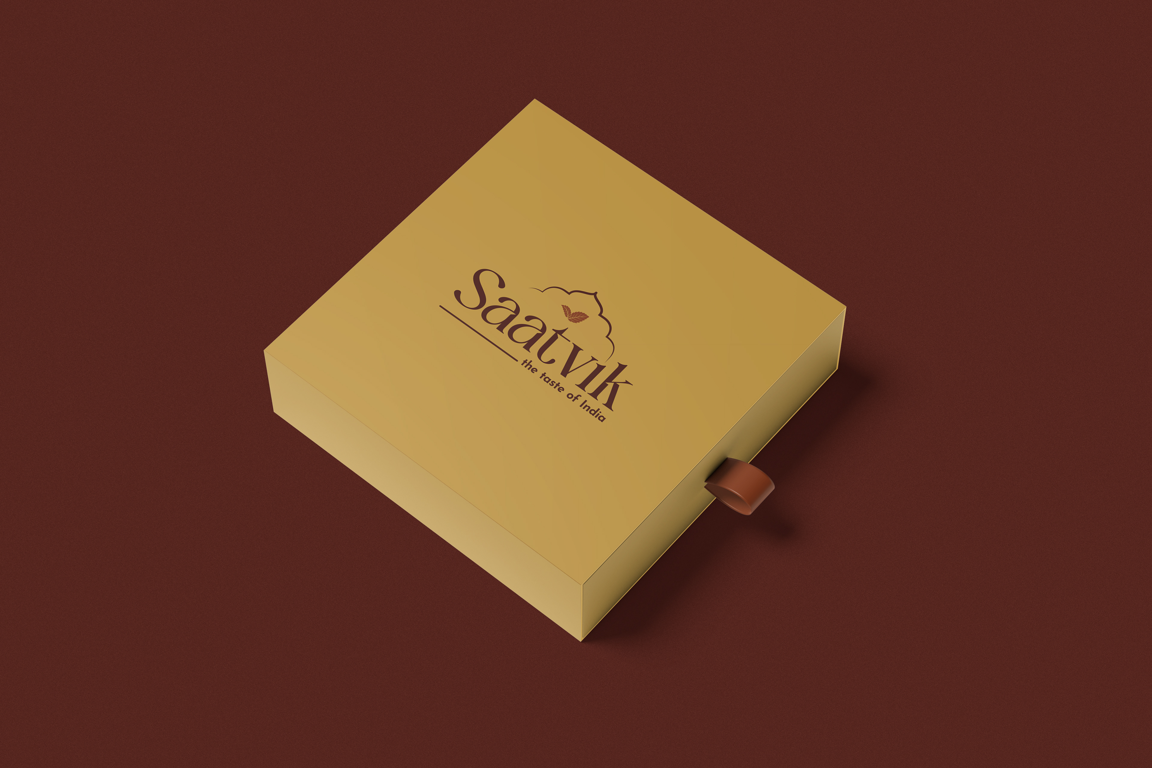
Mithai Box
Designing the Experience of Saatvik:
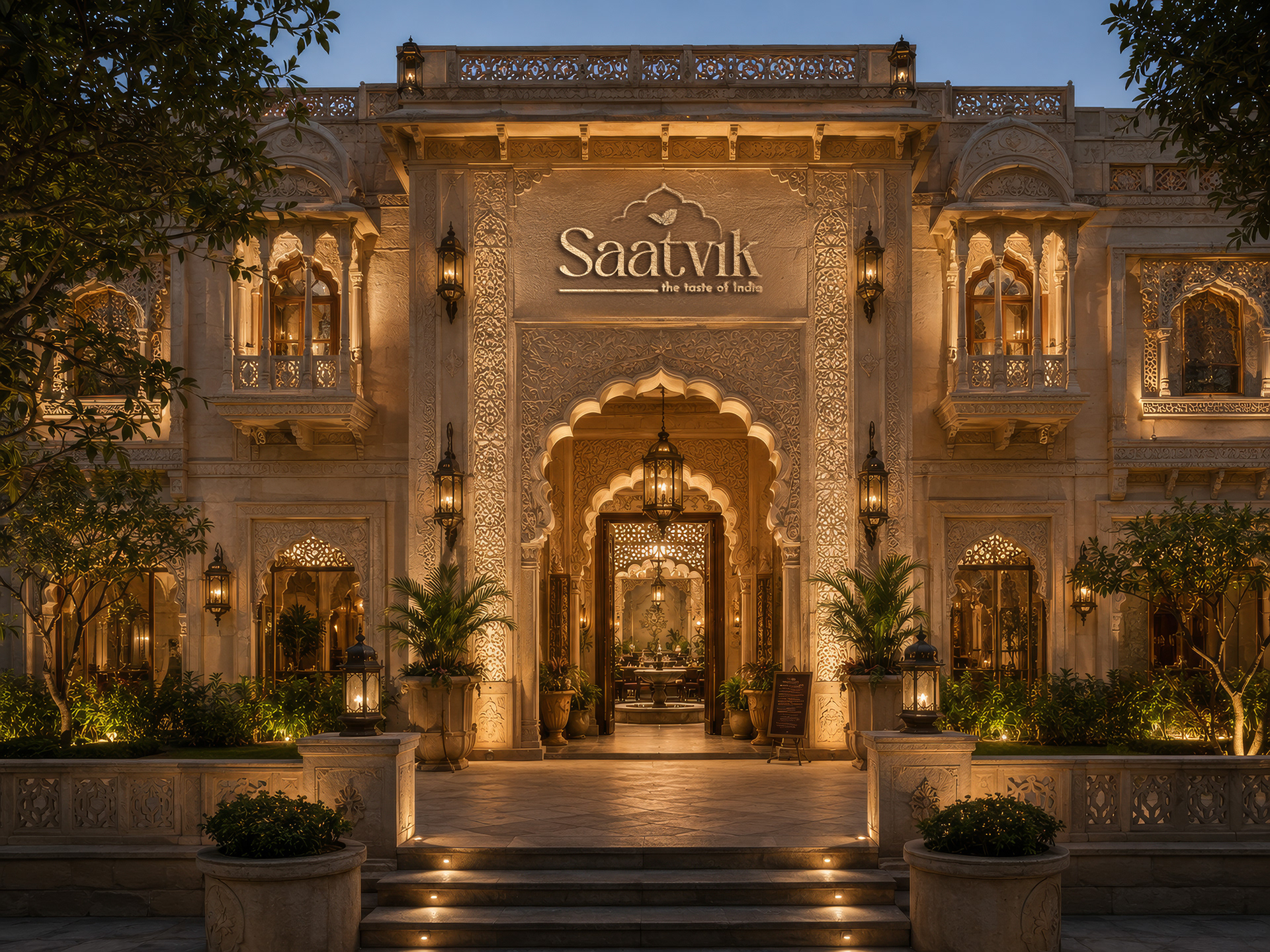
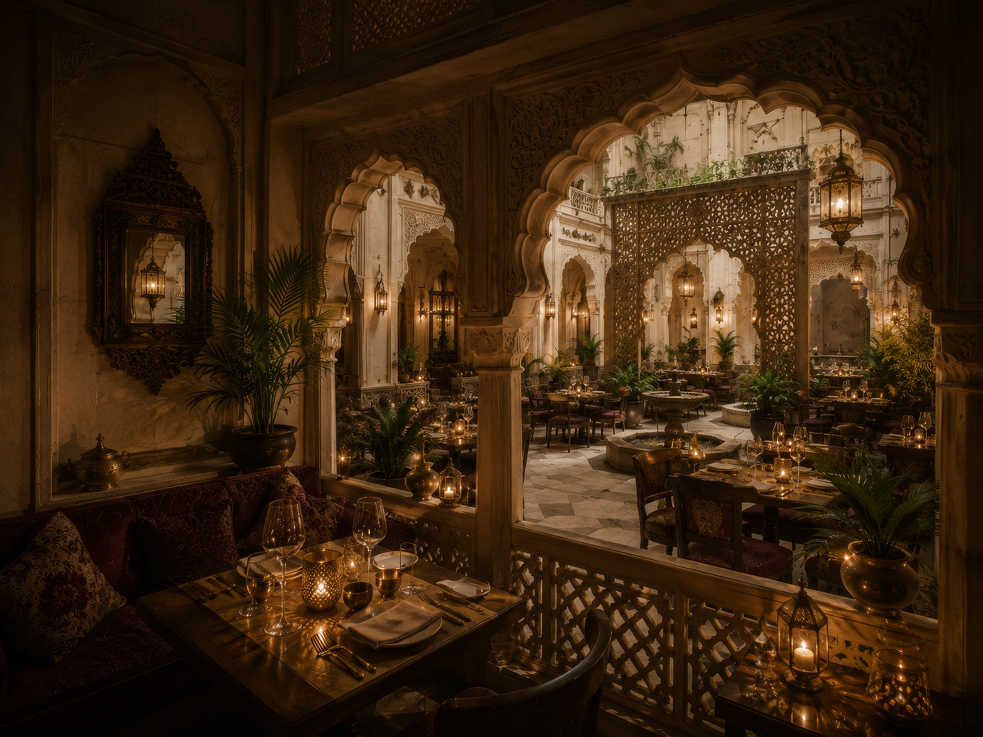
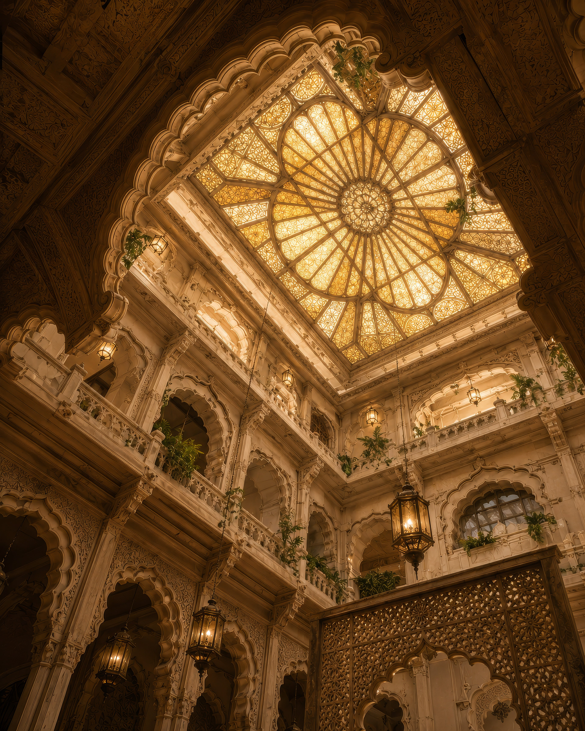
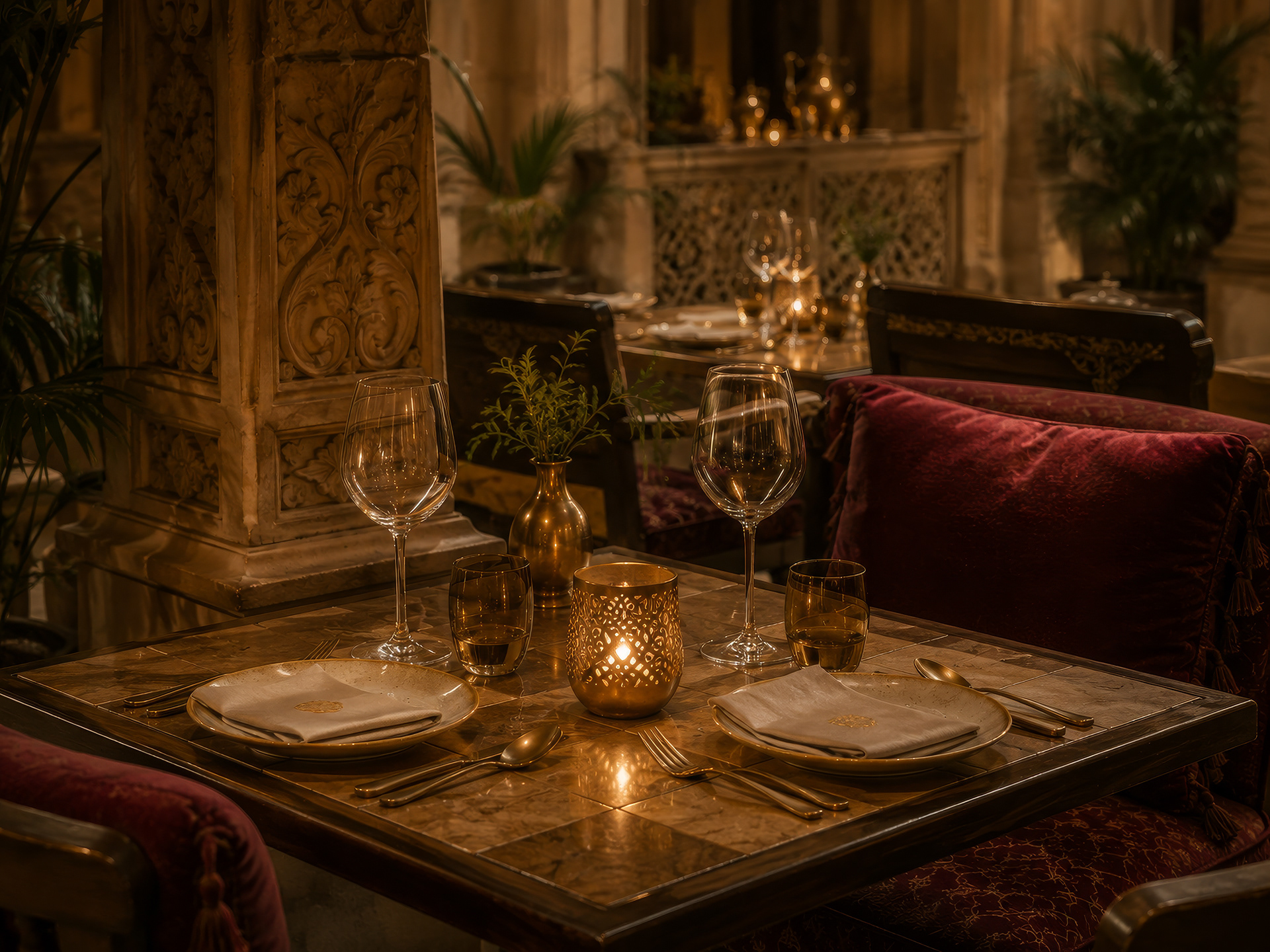
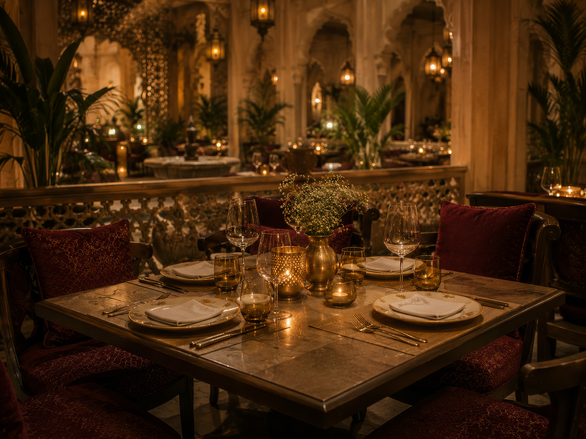
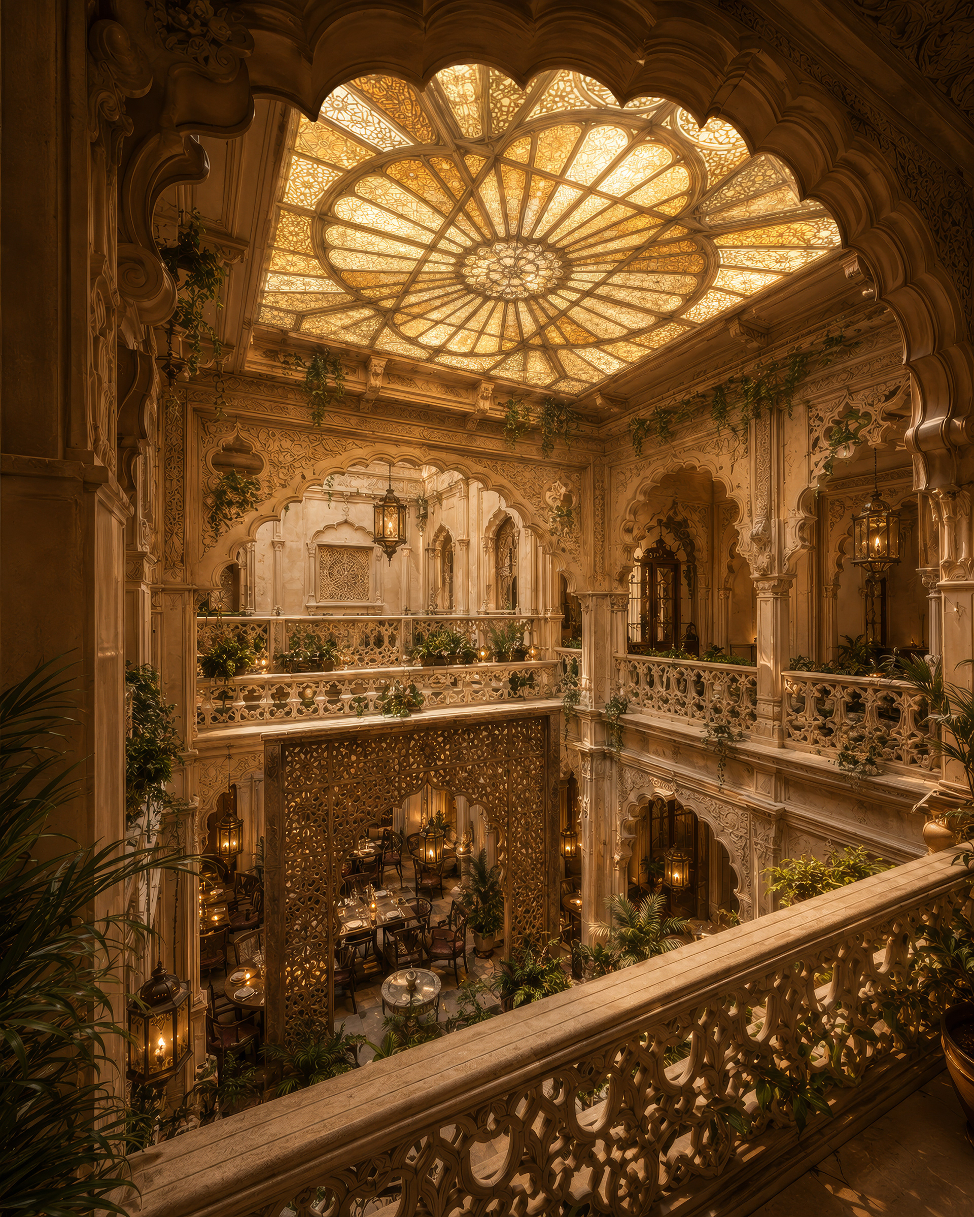
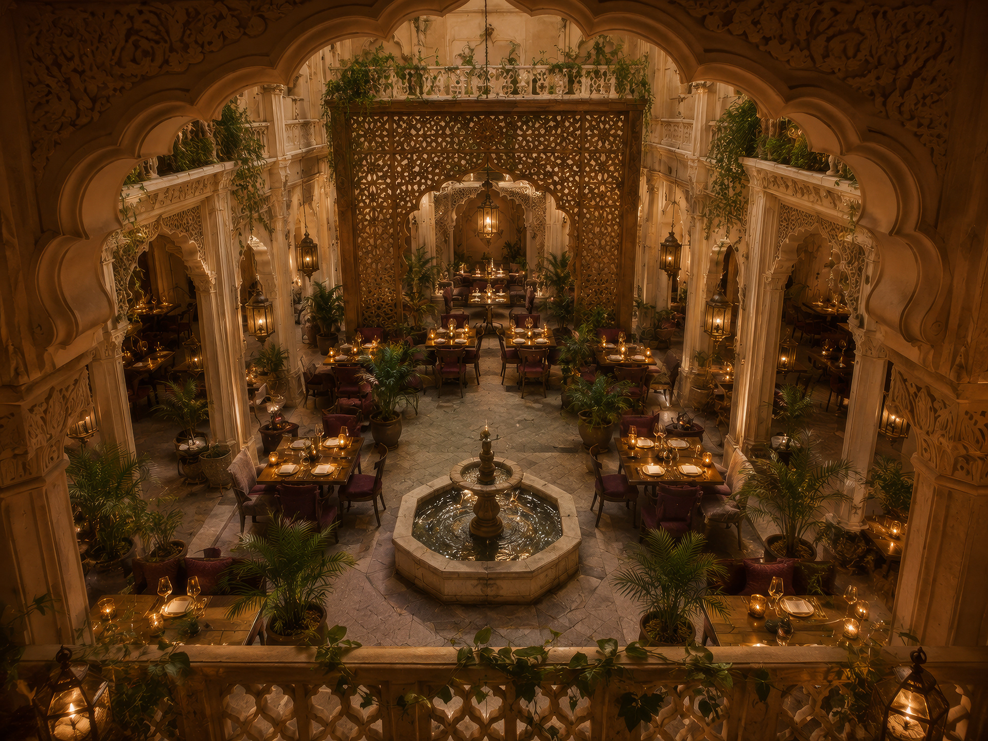
I wanted the brand to feel as though it belonged to a real place, not simply exist as a collection of graphic applications. To explore that relationship, I developed a series of AI-generated conceptual environment visualizations for the restaurant's interior and exterior. The environment imagines Saatvik as a contemporary interpretation of a traditional Haveli. Layered archways, carved details, textured stone, intimate dining spaces, and a central chauk, or courtyard, shape the experience.
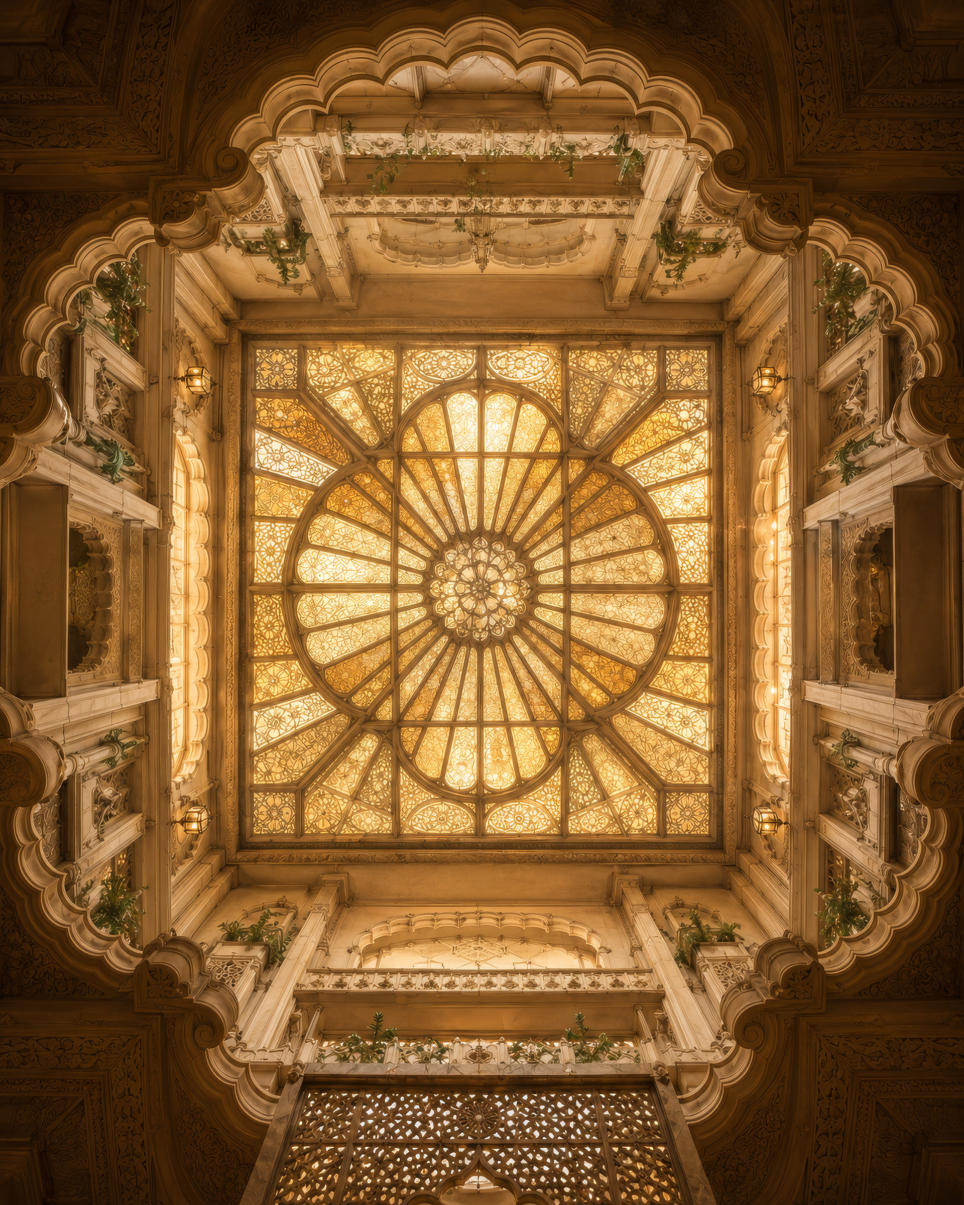
At the center of the restaurant, a tinted glass ceiling filters daylight into a warm golden glow. The idea connects the architectural concept directly back to the identity's palette and creates a changing atmosphere throughout the day.
The exterior continues the same language with an understated sense of grandeur. Rather than appearing like a themed restaurant, Saatvik feels more like entering a haveli that has been reimagined for contemporary hospitality.
These visualizations helped me explore how the identity could extend beyond the page and influence materials, lighting, signage, architecture, and the overall guest experience.
One Brand, One Experience:
Saatvik was designed as more than a restaurant logo. Every element is connected by the same underlying idea: balance between heritage and modernity.
The logo draws from tradition without becoming ornamental. The palette feels luxurious without becoming excessive. Architectural details become graphic elements. Packaging becomes part of the hospitality experience. The physical environment becomes an extension of the brand rather than a backdrop for it.
Together, these pieces create a restaurant identity that feels warm, considered, and deeply rooted in Indian culture while still belonging to the present.
Saatvik is an exploration of what happens when food, architecture, and identity are treated as parts of the same story.